https://qiita.com/takaiyuk/items/e68c493642adfb04310e
2019-01-20T22:00:28+09:00
2019-11-25T22:44:23+09:00
TL;DR
Plotly でグラフ作成する際に役立つと思って自作したヘルパー関数(?)を紹介しています。
Plotly とはインタラクティブで良い感じのグラフをお手軽に作成できるライブラリです。
ただ、matplotlib や seaborn とも異なる独特な書き方があるので、seaborn っぽくデータフレームとX軸・Y軸に当たる列名を与えるだけで良い感じに表示してくれるものがあると嬉しいと思ったので、作成した次第です。
下図は画像ですが、Plotly の強みはインタラクティブに動作することです。具体的には、ホバーするとプロットされた値が表示されたり、グラフの一部を拡大縮小できることです。
これを本記事では確認できませんが、以下で動作を確認できます。
https://nbviewer.jupyter.org/github/takaiyuk/notebooks/blob/master/PlotlyWrapper.ipynb
データ準備
plorly を使用するとき、plotly.offline と plotly.graph_objs を主に使います。
plotly.offlineは与えられたグラフ情報とレイアウト情報を表示するときに、
plotly.graph_objsは表示するグラフ情報やレイアウト情報の中身を作るのに使います。
つまり、後者を使ってヒストグラムやら棒グラフやらの中身を記述したり、グラフのタイトルなどレイアウトの仕方を指定したりして、それらの情報を前者によって統合して表示するといったイメージだと思います。(あやふや)
plotly.offline.init_notebook_mode(connected=True) は jupyter notebook 上で表示するために記入するようです。
import numpy as np
import plotly
import plotly.offline as py
import plotly.graph_objs as go
import seaborn as sns

from IPython.core.interactiveshell import InteractiveShell
InteractiveShell.ast_node_interactivity = "all"
py.init_notebook_mode(connected=True)  # You can plot your graphs offline inside a Jupyter Notebook Environment.
print(f"Plotly version: {plotly.__version__}")  # output: 4.3.0

"""
Colors of Viridis:
https://cran.r-project.org/web/packages/viridis/vignettes/intro-to-viridis.html
"""
C = ['#3D0553', '#4D798C', '#7DC170', '#F7E642']
データは seaborn に標準装備されているものをいくつか使うことにします。
事前に適当な処理も書いておきます。
"""
Load dataset with load_dataset function of seaborn:
https://github.com/mwaskom/seaborn-data/blob/master/titanic.csv
"""
class DataLoader:
    def __init__(self):
        pass

    def load_titanic(self, group=None):
        df = sns.load_dataset("titanic")
        if not group==None:
            df = df.groupby(group)["survived"].mean().to_frame().reset_index()
        return df

    def load_iris(self):
        return sns.load_dataset("iris")

    def load_tips(self, group=None):
        df = sns.load_dataset("tips")
        if not group==None:
            df = df.groupby(group)["tip"].mean().to_frame().reset_index()
        return df

    def load_flights(self, group=None):
        df = sns.load_dataset("flights")
        if not group==None:
            df = df.groupby([group])["passengers"].sum().to_frame().reset_index()
        return df
class PlotlyWrapper:
    def __init__(self):
        self.colors = ["#3D0553", "#4D798C", "#7DC170", "#F7E642"]

    def _convert_to_str(self, arr):
        return np.array(arr, dtype=str)

    def _plotly_layout(self, title=None, xtitle=None, ytitle=None):
        return go.Layout(
            title=title,
            xaxis=dict(title=xtitle, ticklen=5, zeroline=False, gridwidth=2),
            yaxis=dict(title=ytitle, ticklen=5, gridwidth=2),
        )

    def distplot(self, data, col, bin_dict=None, title=None, xtitle=None, ytitle=None):
        trace = [
            go.Histogram(
                x=data[col].values,
                histfunc="count",
                marker=dict(color=self.colors[0]),
                xbins=bin_dict,
            )
        ]
        layout = self._plotly_layout(title=title, xtitle=xtitle, ytitle=ytitle)
        fig = go.Figure(data=trace, layout=layout)
        return py.iplot(fig, show_link=False)

    def boxplot(self, data, col, title=None, xtitle=None, ytitle=None):
        trace = [go.Box(y=data[col].values, marker=dict(color=self.colors[0]))]
        layout = self._plotly_layout(title=title, xtitle=xtitle, ytitle=ytitle)
        fig = go.Figure(data=trace, layout=layout)
        return py.iplot(fig, show_link=False)

    def barplot(self, data, xcol, ycol, title=None, xtitle=None, ytitle=None):
        trace = [
            go.Bar(
                x=self._convert_to_str(data[xcol].values),
                y=data[ycol].values,
                text=data[ycol].values,
                textposition="auto",
                marker=dict(
                    color=data[ycol].values,
                    colorscale="Viridis",
                    showscale=True,
                    reversescale=True,
                ),
            )
        ]
        layout = self._plotly_layout(title=title, xtitle=xtitle, ytitle=ytitle)
        fig = go.Figure(data=trace, layout=layout)
        return py.iplot(fig, show_link=False)

    def countplot(self, data, col, title=None, xtitle=None, ytitle=None):
        trace = [
            go.Histogram(
                x=data[col].values, histfunc="count", marker=dict(color=self.colors[0])
            )
        ]
        layout = self._plotly_layout(title=title, xtitle=xtitle, ytitle=ytitle)
        fig = go.Figure(data=trace, layout=layout)
        return py.iplot(fig, show_link=False)

    def scatterplot(
        self, data, xcol, ycol, size=1, title=None, xtitle=None, ytitle=None
    ):
        trace = [
            go.Scatter(
                x=self._convert_to_str(data[xcol].values),
                y=data[ycol].values,
                mode="markers",
                marker=dict(
                    sizemode="diameter",
                    sizeref=1,
                    size=data[ycol].values ** size,
                    color=data[ycol].values,
                    colorscale="Viridis",
                    reversescale=True,
                    showscale=True,
                ),
                text=self._convert_to_str(data[xcol].values),
            )
        ]
        layout = go.Layout(
            autosize=True,
            title=title,
            hovermode="closest",
            xaxis=dict(title=xtitle, ticklen=5, zeroline=False, gridwidth=2),
            yaxis=dict(title=ytitle, ticklen=5, gridwidth=2),
            showlegend=False,
        )
        fig = go.Figure(data=trace, layout=layout)
        return py.iplot(fig, show_link=False)

    def lineplot(
        self,
        data,
        xcol,
        ycol,
        title=None,
        xtitle=None,
        ytitle=None,
        linewidth=2,
        rangeslider=False,
        slider_type="date",
    ):
        if rangeslider is True:
            xaxis = dict(
                title=xtitle,
                ticklen=5,
                zeroline=False,
                gridwidth=2,
                rangeslider=dict(visible=True),
                type=slider_type,
            )
        else:
            xaxis = dict(title=xtitle, ticklen=5, zeroline=False, gridwidth=2)

        if type(ycol) == list:
            trace = []
            for i in range(len(ycol)):
                t = go.Scatter(
                    x=data[xcol].values,
                    y=data[ycol[i]].values,
                    mode="lines",
                    name=data[ycol[i]].name,
                    line=dict(width=linewidth, color=self.colors[i]),
                )
                trace.append(t)
        else:
            trace = [
                go.Scatter(
                    x=data[xcol].values,
                    y=data[ycol].values,
                    mode="lines",
                    name=data[ycol].name,
                    line=dict(width=linewidth, color=self.colors[0]),
                )
            ]
        layout = go.Layout(
            title=title, xaxis=xaxis, yaxis=dict(title=ytitle, ticklen=5, gridwidth=2)
        )
        fig = go.Figure(data=trace, layout=layout)
        return py.iplot(fig, show_link=False)
dataloader = DataLoader()
plty = PlotlyWrapper()
以下本題です。実際にコードと出力されるグラフを並べて羅列していきます。
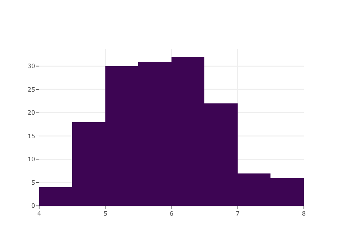
Histogram
df = dataloader.load_iris()
plty.distplot(df, col="sepal_length")
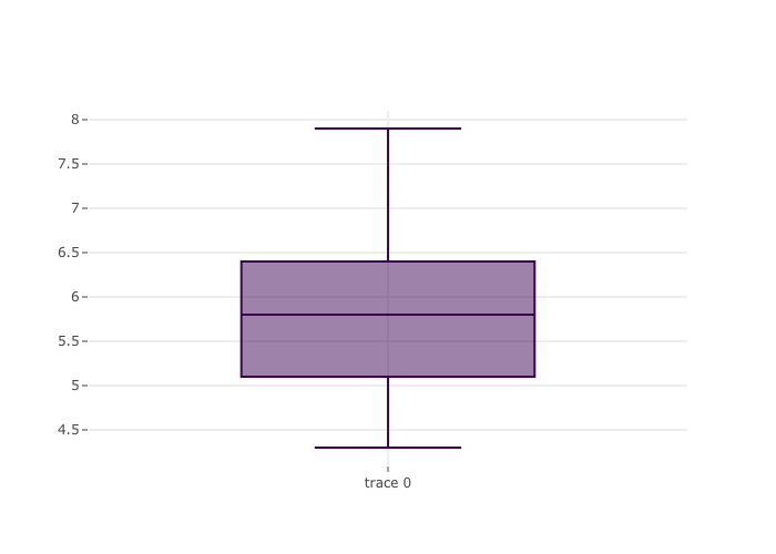
Boxplot
df = dataloader.load_iris()
plty.boxplot(df, col="sepal_length")
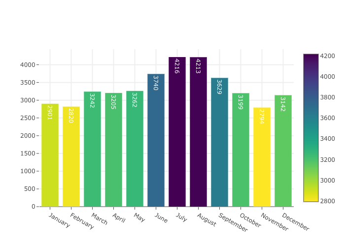
Barplot
df = dataloader.load_flights(group="month")
plty.barplot(df, xcol="month", ycol="passengers")
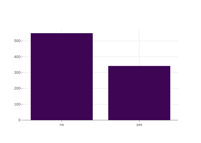
Countplot
df = dataloader.load_titanic()
plty.countplot(df, col="alive")
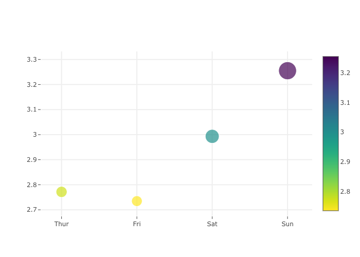
Scatterplot
df = dataloader.load_tips(group="day")
plty.scatterplot(df, xcol="day", ycol="tip", size=3)
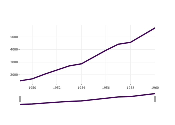
Lineplot
df = dataloader.load_flights("year")
plty.lineplot(df, xcol="year", ycol="passengers", rangeslider=True)
Jupyter Lab を使ってる場合の注意
Plotly をレンダリングするための extension をインストールしておく必要があります。
詳しくは下記URLをご覧ください。